-
Help Support The Rugby Forum :
You are using an out of date browser. It may not display this or other websites correctly.
You should upgrade or use an alternative browser.
You should upgrade or use an alternative browser.
RWC Kits
- Thread starter TRF_Olyy
- Start date
- Joined
- Apr 12, 2015
- Messages
- 7,190
- Country Flag
- Club or Nation

I like the yellow around the rim of the collar itself, but the little stripe right at the front to make it a full circle is what looks a little off to me.Even I know (after 3 posts above) that it is the cross of St David!
Nice jersey, I like it. Don't see anything bad in the yellow around the collar tbh, I like it
Maybe you need to know your history of saints.I do think it's weird that St. George's cross is on the away kit.
The black and yellow cross is the flag of St David.
- Joined
- Apr 27, 2008
- Messages
- 100,019,813
- Country Flag
- Club or Nation

It's clearly a union jack, they just missed out the diagonal bits to save on printing costs
- Joined
- May 20, 2008
- Messages
- 5,582
- Country Flag
- Club or Nation

It's not a black and yellow cross though is it. It's a black cross on a black background.Maybe you need to know your history of saints.
The black and yellow cross is the flag of St David.
View attachment 17163
It's just because the welsh love the English so much they want our flag as well as our players.
- Joined
- Nov 25, 2010
- Messages
- 5,407
- Country Flag
- Club or Nation

...im all for your original point....but you do you know you reply to multiple people in one post dont you?Maybe you need to know your history of saints.
The black and yellow cross is the flag of St David.
I'm seeing Fiji Australia at the World Cup, so I'll be grabbing the away shirt I think
- Joined
- Sep 18, 2015
- Messages
- 7,404
- Country Flag
The England stuff is just urgh. I have a few Canterbury supporters shirts and they'll have to do until we get shot of Umbro.
What I really hate is the ego of having the RWC logo on the front of all the shirts. Paired with the manufacturer's logo and country emblem it makes the top of the shirts look cramped, especially when all 3 are just in a row, exacerbated by no sponsor's logo. We know it's the RWC - shove that logo on the sleeve and that gives the designers a lot more scope.
Nice job by Nike on the Fiji kit. Up there with Argentina 2nd.
I actually like the logo there, breaks it up a bit. Nice shirt, except for the sleeves.
What I really hate is the ego of having the RWC logo on the front of all the shirts. Paired with the manufacturer's logo and country emblem it makes the top of the shirts look cramped, especially when all 3 are just in a row, exacerbated by no sponsor's logo. We know it's the RWC - shove that logo on the sleeve and that gives the designers a lot more scope.
Nice job by Nike on the Fiji kit. Up there with Argentina 2nd.
I like the red one apart from the placement of the macron logo, although I like collar so there is no where else to put it.
I actually like the logo there, breaks it up a bit. Nice shirt, except for the sleeves.
Last edited:
- Joined
- Sep 14, 2012
- Messages
- 5,109
- Country Flag
- Club or Nation

I miss the old logo, the outstretched:What I really hate is the ego of having the RWC logo on the front of all the shirts. Paired with the manufacturer's logo and country emblem it makes the top of the shirts look cramped, especially when all 3 are just in a row, exacerbated by no sponsor's logo. We know it's the RWC - shove that logo on the sleeve and that gives the designers a lot more scope.

That logo added extra value to the shirt. Since 2011 RWC the logos has been lees atractive
- Joined
- Oct 17, 2013
- Messages
- 15,945
- Country Flag
- Club or Nation

Those black ferns are awful. Like a 5 year old has been let loose on it.damn....was thinking might be time for another AB's jersey as has been a while...will check it out in person but pics arent selling me
am i the only one getting hawaiian shirt vibes?
View attachment 16974
edit: have to say, its not going down well on the NZ rugby forum im on, would love to see a year on year jersey sales stat, wonder if theyre dropping, think adidas is out of (good) ideas
Oh the squiggly pen look again
- Joined
- Nov 25, 2010
- Messages
- 5,407
- Country Flag
- Club or Nation

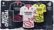
i don't mind that for the officials
- Joined
- Dec 3, 2010
- Messages
- 20,385
- Country Flag
- Club or Nation

Weird marketing continues, lads look like they're just out of a rave. I'm certain they've changed the colour though.
- Joined
- Apr 27, 2008
- Messages
- 100,019,813
- Country Flag
- Club or Nation

X Factor auditions
- Joined
- Jun 23, 2017
- Messages
- 2,916
- Country Flag
- Club or Nation

Irish IdolX Factor auditions
- Joined
- Dec 3, 2010
- Messages
- 20,385
- Country Flag
- Club or Nation

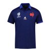
https://boutique.ffr.fr/maillot-training-xv-de-france-2023-le-coq-sportif-bleu-homme.html
This is better than any jersey. I'm so tempted.
This is better than any jersey. I'm so tempted.
- Joined
- Nov 12, 2015
- Messages
- 11,580
- Country Flag
- Club or Nation

Similar threads
- Replies
- 20
- Views
- 1K


